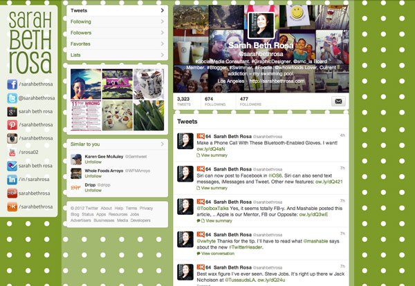
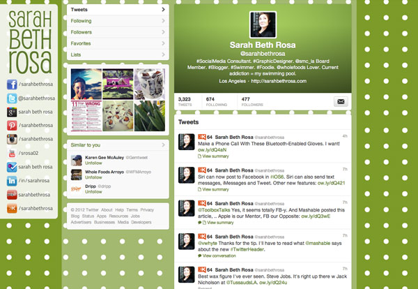
Earlier today I found myself in a mini mass-tweet session with @ToolboxTalks after I tweeted about boycotting the new Twitter Header, and they responded asking why:
@sarahbethrosa What don't you like about it? A little cluttered? #TwitterHeader #graphicdesign
— Toolbox Design (@ToolboxTalks) September 19, 2012
So here’s my Top 7 Reasons Why the New Twitter Header Doesn’t Make Sense to Me:
- Can’t control the design because they added black overlay.
- White text, usually a problem.
- Not pleasing to the eye.
- Takes up unnecessary space.
- Trying to look like Facebook Timeline.
- I prefer the first launch of Twitter Headers, as shown on Coca-Cola’s Page.
- Doesn’t make sense to change the whole interface when this is just to help the mobile presence.
I did attempt to make myself a kick-ass Twitter Header, but didn’t like the results.


After seeing this post on Mashable today, 4 Quick Tips for a Better Twitter Header, I’m willing to give it a second try. I would like to keep my Twitter profile up to date, and make it stand out on the iPad. I am definitely going to update my client pages so they stay on top of social media trends!
What are your thoughts about the new Twitter Headers? Please comment below.